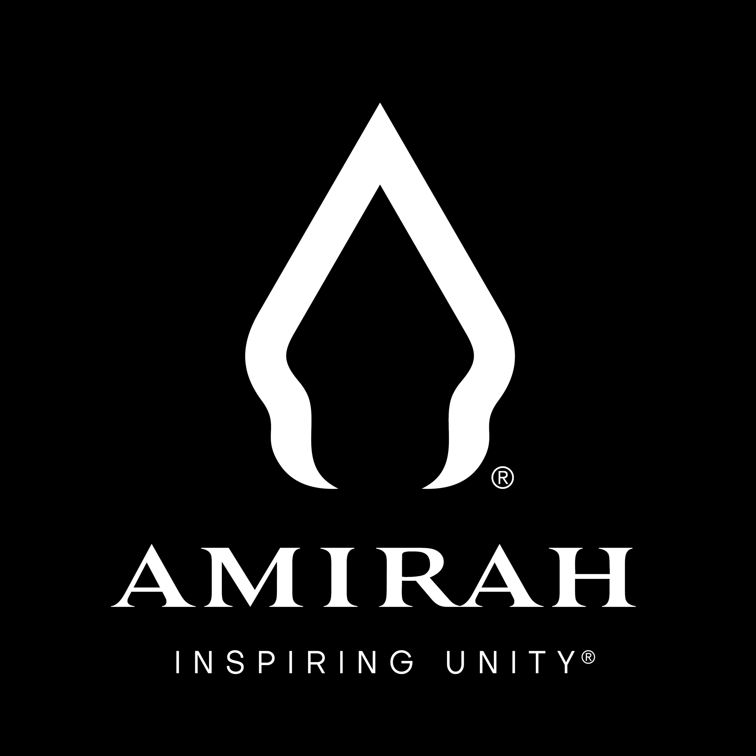
The Amirah Logo: A Backstory
I thought of sharing the story behind designing my logo today. I’ve never shared this before and often wondered if my fans would be curious to know, so here goes.
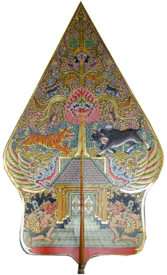
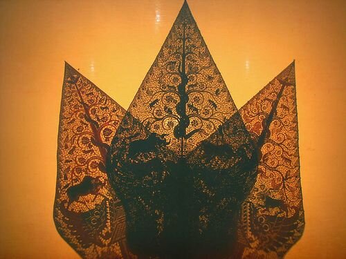
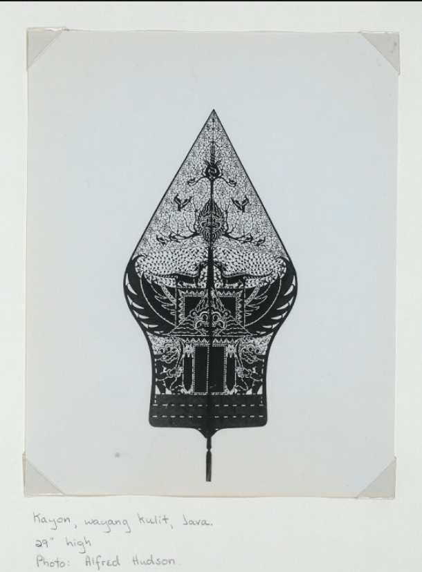
The Amirah logo was born from my fascination with the 'Kayon', a symbol typically found in a traditional form of Indonesian shadow puppet art called 'Wayang Kulit'.
As some of you might know, I've always had a deep love for the sound of the Gamelan, (traditional ensemble music from Indonesia), and it's had a very deep influence on my music for a while now.
The 'Kayon' though, was particularly fascinating for me at first glance. For one, its resemblance with the letter 'A' (my first initial) turned upside down intrigued me immediately, and the intricate detail of the designs and the stories I later found out they represented felt very close to my heart. Incidentally, another name for the Kayon is 'Gunungan', which roughly translates to 'The Tree of Life'. So being the nature-lover that I am, this resonated deeply with me as well.
On further investigation, I discovered that the 'Kayon' plays a very specific significance in Indonesian puppet art.
Used at the very beginning and end of performances, it symbolizes cycles. For those who don’t know, Gamelan music is cyclical in nature, an aspect of this ancient form of art that is reflective of its belief that all of life is interconnected. Including beginnings and the ends. For such is the circle of life. I found this incredibly moving.
The overall symmetry and geometrical lines of the Kayon have a timeless look to it which, though rooted in ancient tradition, looks very futuristic. The contrast felt aptly representative of the duality I have always felt within me as a hybrid cultural being and the vision I’ve always had for my music. A uniquely progressive outline ornamented richly with timeless tradition and wisdom amalgamating both eastern and western worlds.
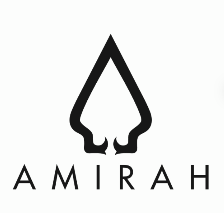
And so I started researching 'Kayon' designs online. Saving the ones I liked while I did (I've shared one or two below with you here as well). Then I tried some sketches on paper. I happen to be a more visual and kinesthetic person, so I like to animate and look at all angles, try out multiple combinations on paper, fine-tuning them, and then shortlist the ones I like the best.
Eventually, I took my ideas to a couple of graphic designers. The results were a little disappointing at first. Some would be too cute, some overtly feminine, and some just too 'corporate'. Needless to say, it isn't always easy to understand an artist’s vision when it comes to visual design. It's a little more complex than designing somewhat generic logos for commercial products like soda or toothpaste!
Full disclosure? At a certain point, I came close to giving up. Until someone advised me to try out 99 Designs. I dreaded the idea initially since their system is based on a contest and I’m not a huge fan of competitive approaches. But at the time I’d started to feel like I didn't really have a lot of other options.
Turns out that 99 designs ended up saving the day. And 300 daily messages for over a month later (!) I finally had my logo!
I have to admit, the sensory overload of the constant digital correspondence and the pressure to constantly respond with a deadline in mind was exhausting. But I guess it was worth it.
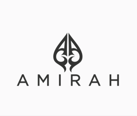
Here are some of the images I went through before settling on the final one.
I hope you enjoyed this story and the images.
Stay safe and healthy this weekend.